Free Shipping on US orders over $150
-
Collections
-
Bikini
- One Pieces
- Cover-Ups
- Men's
- Sale
- MODA GLAM x L'ANIMAL
- Nice Breed
-


Patterns steer the eye. The print’s type, scale, placement, and contrast control where attention lands; that determines how a swimsuit reads on the body. Choose a print that guides focus toward what you want to highlight and away from what you don’t.
Key signals behind that claim:
Pick prints that guide the eye toward features you want to highlight and away from those you don’t.
Print type, scale, and placement together determine whether a swimsuit flatters or fights the body wearing it.
| Point | Details |
|---|---|
| Pattern type controls focus | Verticals elongate; horizontals widen; color-blocking cinches; large motifs draw attention to where they sit. |
| Scale vs. frame | Large prints magnify; small dense prints slim and read as near-solid from a distance. |
| Placement over print | Avoid bold motifs on the crotch; center bust motifs; align directional prints across all panels. |
| Test before buying | Stretch the print area for cracking; hold fabric to light for opacity; check elastane percentage on the label. |
| Lanimal’s approach | Lanimal centers motifs, double-lines light prints, and maps placement before cutting for flattering results. |
Different pattern families produce predictable visual effects. Knowing the logic lets you match a print to a specific goal.
For men, vertical stripes on board shorts add the appearance of height and a leaner leg line. Tonal microprints on trunks read as near-solid from across the pool, which suits a streamlined look without going plain.
Scale refers to the size of a single motif and how much space sits between repeats. Directionality describes whether the print has an obvious up-down orientation.
Viewing distance matters. A print that reads as bold in a dressing room mirror may read as near-solid on a beach from ten feet away. Bright sunlight flattens contrast and compresses detail, which is why WGSN notes small chaotic prints as practical for beachwear conditions.
Pro Tip: Hold the garment at arm’s length and squint. If the print blurs into a tone, it will read as a solid in bright light. If the motifs stay distinct, they will draw attention at beach distance. Compare a motif’s size to your palm to gauge scale before buying.
Placement is where print design becomes body design. The finished suit is a canvas, and where a focal motif falls on the body determines what the eye notices first.
Rules for flattering placement:
Cutting printed fabric in a single layer and laying out all pieces first gives the maker full control over where each motif lands before a single cut is made. Photographing the layout before cutting is a standard production step at quality-focused studios.
Shopper checklist when buying online:
Pro Tip: For directional prints, ask the retailer whether panels are cut in a single layer. A brand that cannot answer that question likely does not control motif placement at the production stage.
A print that looks sharp on a hanger can distort, crack, or go transparent the moment it hits water. Four factors determine whether a print holds up.
| Factor | What to check | Risk if ignored |
|---|---|---|
| Elastane content | 15–25% for shaping; below 10% for minimal stretch | Low elastane causes print cracking under stretch |
| Four-way stretch | Pull fabric in both directions | One-way stretch distorts motifs on the bias |
| Opacity / lining | Full double-lining or power mesh front panel | White or pale prints go see-through when wet |
| Colorfastness | Check care label for “wash separately” warning | Dye bleeds onto skin or other garments |
Higher elastane content, full double-lining, and internal power mesh panels are production features that maintain opacity and shaping, which matters most for patterned or light-colored swimwear. Double-layered swim fabrics add both opacity and structural support that keeps a print looking intentional rather than accidental after repeated wear.
Quick in-store checks:
Match the print to a visual goal, not just a preference.
For men, tropical prints worn with confidence work best when the scale of the print matches the wearer’s frame. A large-scale Hawaiian print on a lean frame can overwhelm; the same print on a broader frame reads as proportionate.
Do horizontal stripes always widen? Not always. Narrow, closely spaced horizontal stripes on a dark ground can read as texture rather than width-adding bands. The contrast between stripe and ground matters as much as the stripe’s direction. High-contrast prints are most flattering when placed where you want attention, least flattering where you don’t.
Pro Tip: *For online purchases, check the fabric content listed on the product page.
Lital Simel-Rhedrick’s design process at Lanimal starts with placement before it starts with the print itself. The questions are: where will this motif land on the body, and does that placement serve the wearer?
Specific practices that carry through to the finished garment:
Lanimal’s color and fabric guides extend this placement-first thinking into color contrast and fabric choice, giving shoppers a reference point for understanding why specific prints were selected for each style.
Swimwear prints have always reflected the cultural moment they came from. Hawaiian florals entered American beachwear in the 1930s and 1940s as tourism to the Pacific grew. The bold geometric prints of the 1960s and 1970s tracked directly with the Op Art movement, where artists like Bridget Riley were demonstrating that pattern alone could create the illusion of movement and depth. Animal prints cycled through the 1980s as power dressing extended from office to beach.
More recently, global fashion weeks and social media have compressed the trend cycle. A print that appears on a runway in February can reach swimwear collections by summer. Cultural exchange has broadened the vocabulary: African wax prints, Japanese shibori patterns, and South American geometric weaving traditions now appear regularly in designer swimwear collections sold in the United States.
Color psychology research consistently links specific hues to mood and perceived energy. Warm colors, particularly red and orange, tend to read as high-energy and attention-drawing. Cool blues and greens read as calm and receding. These effects interact with pattern: a bold red geometric draws more attention than a muted blue one of identical scale.
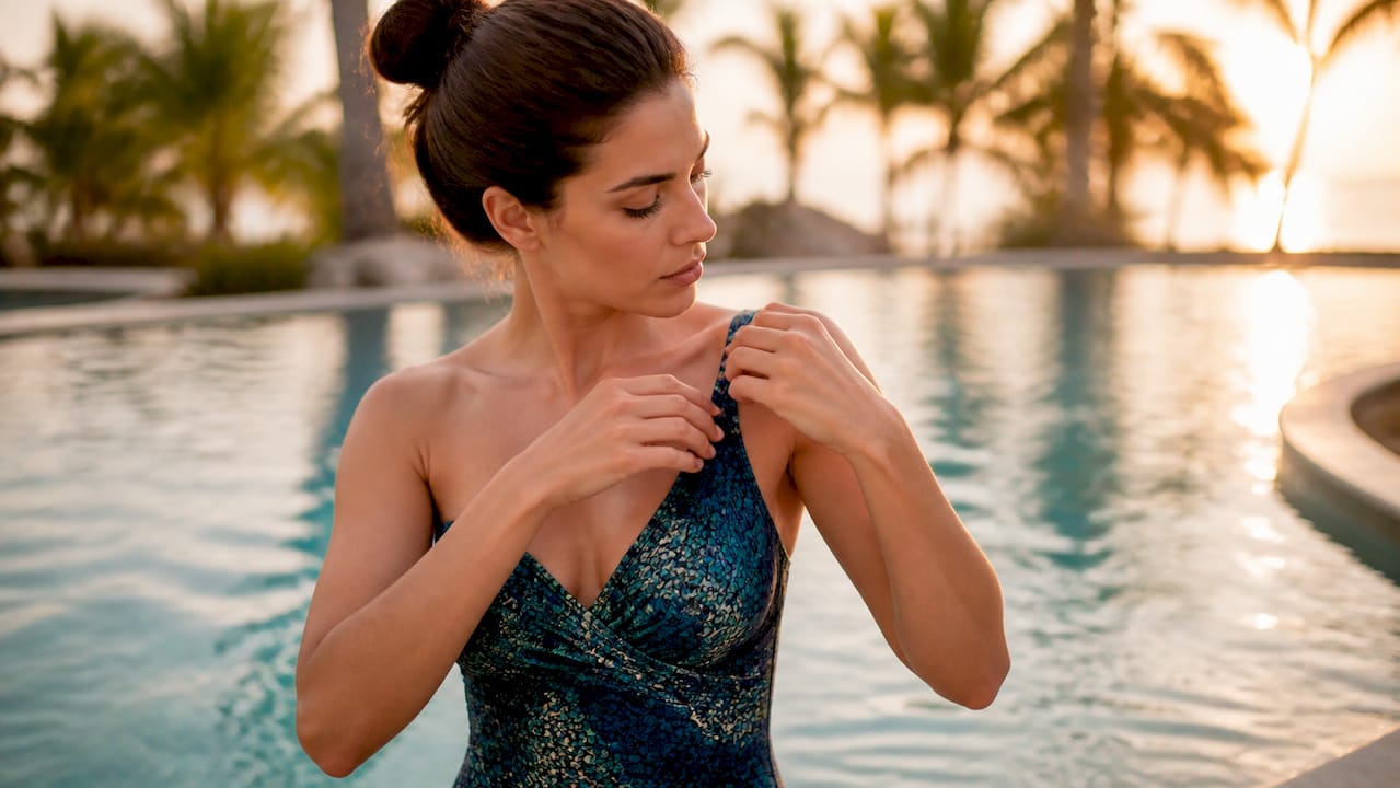
Pattern density also affects perceived confidence. Busy, high-contrast prints signal boldness and tend to attract social attention. Quieter tonal prints or near-solid microprints signal restraint. Neither is better; the choice depends on the wearer’s intent. Body-positive swimwear styling consistently shows that wearing a print you chose deliberately, rather than one you settled for, produces a measurable difference in how a person carries themselves.
Fabric construction, not print, is the primary driver of UV protection in swimwear. A tightly woven or knitted fabric with higher fiber density blocks more UV radiation regardless of whether it carries a print. The UPF (Ultraviolet Protection Factor) rating on a garment reflects the fabric’s construction and fiber content.
That said, darker colors and denser prints do absorb more UV radiation than pale or white fabrics, which tend to reflect and transmit more light. A white swimsuit with minimal lining offers less UV protection than a dark, double-lined one. For extended sun exposure, look for a UPF rating on the label rather than relying on color or print as a proxy for protection.
Printing is one of the more resource-intensive steps in swimwear production. Traditional screen printing uses water-based or plastisol inks that require significant water in the wash-off process. Digital printing reduces water use and allows smaller print runs, which cuts fabric waste from overproduction.
Recycled nylon (often sold under the Econyl brand name) and recycled polyester are now common base fabrics for printed swimwear. These materials perform comparably to virgin synthetics for stretch and recovery, and they accept digital prints well. Recycled fabrics in swimwear reduce the raw material footprint without compromising the print quality or opacity that flattering swimwear requires.
Colorfastness is also a sustainability issue. A print that bleeds or fades quickly shortens the garment’s useful life. Reactive dyes bonded at the fiber level hold color longer than surface-applied inks, reducing the frequency of replacement.
Most shoppers evaluate a swimsuit print by asking whether they like the motif. The more useful question is where that motif will land on their specific body. A print that photographs beautifully on a flat garment can land in an unflattering position on a three-dimensional body, and no amount of color or scale adjustment fixes a placement problem after the suit is cut.
Small placement decisions, like centering a bust motif or keeping the crotch panel clean, are the difference between a suit that looks designed and one that looks assembled. These are not details that add cost; they are details that require intention at the pattern-layout stage. When a brand controls placement at that stage, the result is visible in the finished garment.
Lanimal designs each print with placement mapped before cutting. The Sportif Bikini Bottom demonstrates this approach: the crotch panel is kept free of bold motifs, and the cut is designed to work with vertical and diagonal print directions that lengthen the leg line.
Every Lanimal piece uses double-lining on light-colored prints and fabrics tested for stretch and opacity. Browse the full collection at Lanimal to find prints selected and placed to flatter, not just to look good on a hanger.


