Free Shipping on US orders over $150
-
Collections
-
Bikini
- One Pieces
- Cover-Ups
- Men's
- Sale
- MODA GLAM x L'ANIMAL
- Nice Breed
-


Bikini color choices matter because they change how your skin tone reads, how visible you are in water, and the mood you project — though they do not change how much UV radiation reaches your skin. The fabric’s UPF rating, weave density, and coverage area do that. Color works on perception, not physics.
Four things color directly affects:
The Skin Cancer Foundation and the U.S. Swim School Association both address color in the context of sun safety and water visibility. Lital Simel-Rhedrick, designer and stylist behind Lanimal, builds these considerations into the brand’s palette and fabric selections.
Pro Tip: Check your undertone before you shop, not after. It takes 30 seconds and eliminates most color mistakes.
The short answer: no. Color does not alter how much melanin your skin produces. That process is driven by UV-B radiation, your skin’s phototype, time in the sun, and whether you are wearing sunscreen. A dark bikini does not “attract” more sun or accelerate tanning. That claim is a myth.
What color does affect is how your tan looks against the fabric. High-contrast pairings, like a white bikini against bronzed skin, make the tan appear more pronounced. A bikini close to your skin tone flattens the visual difference and makes the tan less visible. The tan itself is identical either way.
| Factor | Affects actual UV exposure? | Affects perceived tan depth? |
|---|---|---|
| Swimsuit color | No | Yes |
| UPF-rated fabric | Yes | No |
| Coverage area | Yes | No |
| Sunscreen SPF | Yes | No |
| Time in sun | Yes | No |
Fabric testing confirms that UPF ratings and weave density are the measurable variables for UV protection, not color. A loosely woven white fabric can transmit more UV than a tightly woven dark one, but neither color alone is a reliable proxy for protection.
Drowning is a leading unintentional cause of death in the United States, according to CDC figures cited by Popular Science. Swimsuit color is one layer of safety in open water, not a substitute for supervision, barriers, and swim skills.
UPF (Ultraviolet Protection Factor) measures how much UV radiation a fabric blocks. A UPF 50 garment blocks roughly 98% of UV rays. The rating depends on weave tightness, fiber type, fabric weight, and dye density — not color alone.
Wet fabric is a real variable. When many synthetic fabrics get wet, the weave stretches slightly and UV transmission increases. Some fabrics lose a meaningful portion of their dry UPF rating when saturated. This is why a UPF label tested dry may not fully represent in-water performance.
Where color does interact with UPF:
Color is a weak signal for protection. Weave density and a certified UPF label are the reliable ones.
Pro Tip: Look for the UPF 50+ label and check whether the rating was tested wet. The Skin Cancer Foundation maintains a list of recommended sun-protective products that have passed independent testing.
When shopping, prioritize:
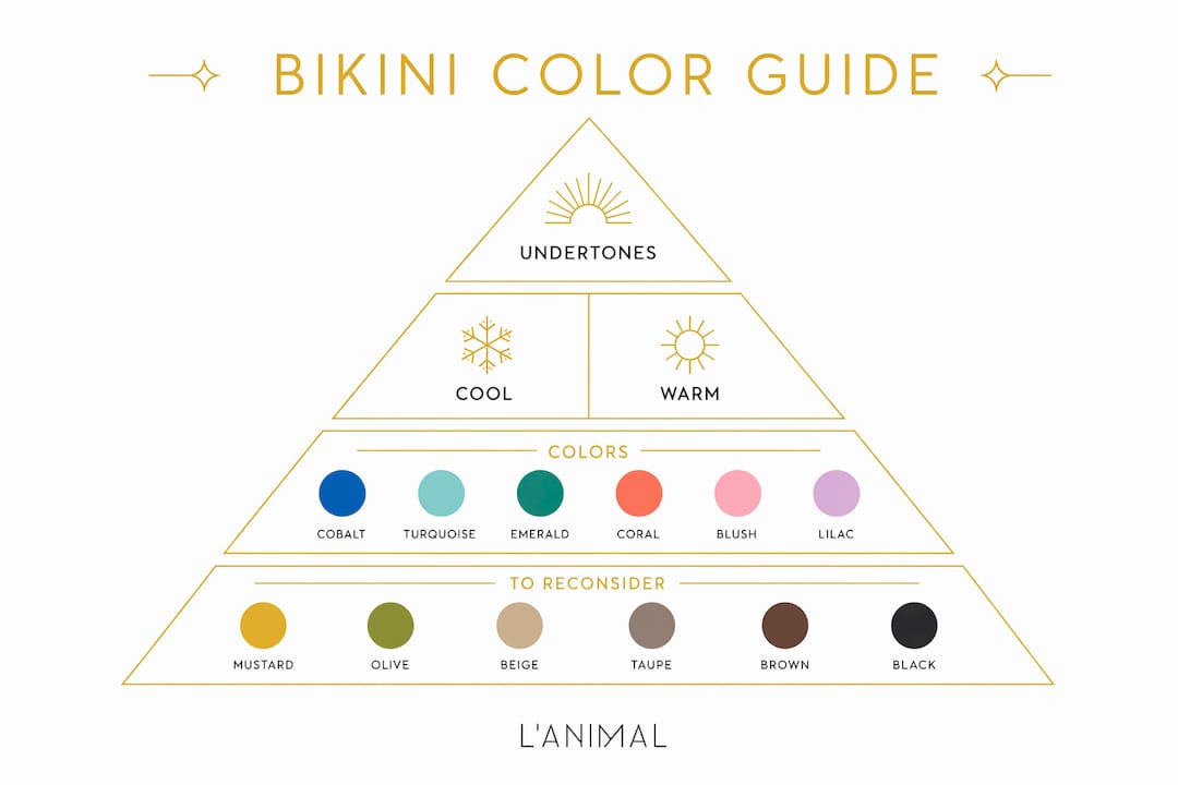
Undertone is the single most reliable predictor of which colors will harmonize with your complexion. Surface tone (fair, medium, tan, deep) tells you how light or dark your skin is. Undertone tells you whether it leans cool (pink, red, bluish), warm (yellow, peach, golden), or neutral (a mix of both).
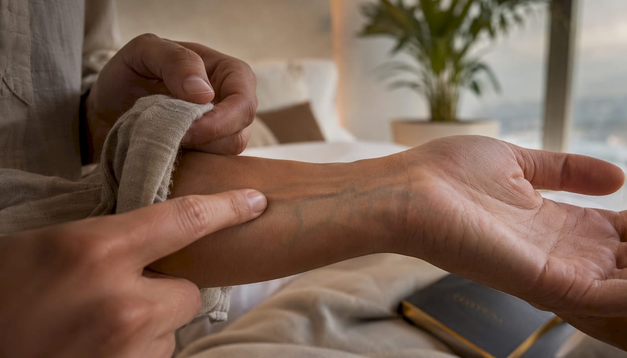
Quick undertone check: Look at the veins on your inner wrist. Blue or purple veins suggest cool undertones; green veins suggest warm. If you see both, you are likely neutral. Silver jewelry tends to flatter cool undertones; gold flatters warm.
Once you know your undertone, color selection becomes much more direct.
| Skin tone | Undertone | Colors that work | Colors to reconsider |
|---|---|---|---|
| Fair | Cool | Cobalt, emerald, jewel pink, navy | Pale peach, nude, beige |
| Fair | Warm | Coral, warm red, golden yellow, rust | Icy blue, silver-gray |
| Medium/olive | Cool | Royal blue, fuchsia, deep plum, teal | Muddy browns, khaki |
| Medium/olive | Warm | Burnt orange, terracotta, olive green, gold | Pastel lavender, cool gray |
| Tan | Cool | Bright white, electric blue, hot pink | Tan/camel tones |
| Tan | Warm | Warm white, amber, deep coral, bronze | Icy pastels |
| Deep | Cool | Bright white, cobalt, jewel tones, red | Muddy neutrals |
| Deep | Warm | Rich gold, warm orange, deep green, camel | Cool pastels, silver-gray |
Neutral undertones have the most flexibility. Virtually any saturated color works; the main thing to avoid is a hue so close to your skin tone that it creates a washed-out effect.
Prints follow the dominant color rule. A floral with a coral base reads as coral against your skin. Evaluate the background color, not the accent colors, when applying these guidelines.
Color contrast is the mechanism behind most of these effects. High contrast between fabric and skin makes both read more vividly. Low contrast softens and blends.
| Visual goal | Color approach | Why it works |
|---|---|---|
| Look more tanned | White, bright white, or high-contrast neons | Maximum contrast against bronzed skin makes the tan pop |
| Look more tanned | Warm coral or gold on medium/olive skin | Complementary undertones amplify warmth in the skin |
| Appear slimmer | Dark solids (black, navy, deep plum) | Darker colors absorb light and reduce visual weight |
| Draw attention upward | Bright or patterned top, darker solid bottom | Eye moves toward the lighter, more complex element first |
| Highlight shoulders | Off-shoulder or halter in a saturated color | Saturated hues at the shoulder line frame the face |
| Minimize midsection | Darker center panel or solid dark bottom | Reduces contrast at the midsection relative to the rest |
A few practical notes:
For readers interested in how cut and silhouette reinforce these color effects, high-waisted bikini styles add another layer of control over where the eye lands.
Color selection in swimwear functions as intentional emotional regulation. Wearers pick colors to manage how they feel in an exposed public space, not just to look good in photos. That is a meaningful distinction.
Research-backed associations that hold up across multiple studies:
Color meanings also carry cultural weight. Red reads as excitement and passion across most Western contexts. White signals freshness and simplicity. These associations are not universal globally, but they are consistent enough in the U.S. market to factor into a deliberate color choice.
Pro Tip: Prioritize how a color makes you feel over strict undertone rules. Confidence frequently outperforms a theoretically perfect color match. If a color makes you stand taller, wear it.
Shopping checklist:
Photo tips for online shopping:
Packing checklist for vacation:
Fit and color are not independent decisions. A color that works on a hanger can read completely differently depending on where the fabric sits on the body, how much coverage it provides, and whether the cut creates contrast at the right points. Lital Simel-Rhedrick’s approach at Lanimal treats color and cut as a single design decision.
A few practical points from that design philosophy:
For more on how color trends interact with styling choices, Lanimal’s swim fashion color guide covers seasonal palettes and how to apply them by skin tone.
Color is one variable in sun safety, not the primary one. Before you leave for the beach:
Color myths worth dismissing: a darker bikini does not cause a deeper tan, and a white bikini does not reflect UV away from your skin. Neither claim has support in fabric science.
Bikini color choices affect how your skin tone reads and how visible you are in water, but UPF-rated fabric and coverage are what actually control UV exposure.
| Point | Details |
|---|---|
| Color affects perception, not UV dose | A darker bikini does not increase tanning; it changes how your existing skin tone reads against the fabric. |
| Match color to undertone for harmony | Cool undertones suit jewel tones and cobalt; warm undertones suit coral, rust, and amber. |
| Wear neon for open-water visibility | Neon orange and neon yellow are the most detectable colors in pools, lakes, and oceans; blue and black disappear fastest. |
| Prioritize UPF and coverage for protection | A UPF 50+ label and tight weave are the reliable sun-protection indicators, not color alone. |
| Lanimal curates color and cut together | Lanimal’s palette spans high-contrast and warm-neutral options designed to work across fair to deep skin tones, with fabrics that hold structure when wet. |
Color selection is one of the most personal decisions in swimwear, and the rules are more flexible than most guides suggest. Undertone matching is a useful framework, but it is a starting point. The color that makes you feel most present and confident at the beach is doing its job, regardless of where it falls on a color wheel.
At Lanimal, the palette is built around that idea: colors that photograph well, hold up in water, and work across a real range of skin tones. Fabric quality and fit are not separate from color; they are what make the color land correctly on the body. A well-cut piece in the right color does not need to be explained or justified. It simply works.
For readers who want to go deeper on styling, the body-positive styling guide on the Lanimal blog covers how to combine color, cut, and confidence across every body type.
Lanimal selects swimwear fabrics that maintain their structure and visual line in water, which matters for both UPF performance and how color reads when you are actually swimming rather than standing still on the sand. The color ranges span saturated jewel tones, warm neutrals, and high-contrast options, covering the full spectrum of undertone recommendations in this article.

The Sportif Bikini Bottom is a direct example of that approach: a clean, structured cut available in colors selected to work across skin tones, with fabric that holds its shape wet or dry. If you are applying the undertone guidance from this article, it is a practical place to start. Lanimal also offers straightforward exchange and return options, so getting the color right does not require committing to a guess.


