FREE SHIPPING ON ALL US ORDERS OVER $150
-
Collections
-
Bikini
- One Pieces
- Cover-Ups
- Men's
- Sale
- MODA GLAM x L'ANIMAL
- Nice Breed
- Gift Card
-

The role of color in swim fashion goes far deeper than picking your favorite shade before a beach trip. Color determines how visible you are in the water, shapes how others perceive you, and signals where fashion is heading each season. Most people treat swimsuit color as a purely personal call. It is not. The right color can make a swimmer easier to spot in seconds during an emergency, while the wrong one blends so well into the water it becomes a safety liability. This guide covers all of it — the safety science, the 2026 trends, and how to choose colors that work for your body, your environment, and your style.
| Point | Details |
|---|---|
| Color directly affects safety | Bright neon shades give lifeguards and parents critical extra seconds to spot swimmers in trouble. |
| 2026 trends run in two directions | Bold fuchsias and lime greens dominate one end; muted terracottas and warm neutrals anchor the other. |
| Fabric type determines color life | Polyester and nylon hold dye far better than cotton when exposed to chlorine and UV light. |
| Skin tone guides flattering choices | Matching swimwear to your undertone, hair, and eye color creates a more polished, effortless look. |
| Care habits protect color vibrancy | Rinsing promptly and drying in shade slows fading and keeps your swimsuit looking new longer. |
Most conversations about swimwear color start and end with aesthetics. That is a mistake. Before color becomes a style decision, it is a safety decision — and the data behind it is striking.
Neon swimsuit colors like neon yellow, bright orange, neon green, and bright pink rank highest in visibility tests across pools, lakes, and open ocean. These shades give parents, coaches, and lifeguards precious additional seconds to locate a swimmer in distress. In low-visibility conditions — murky lake water, heavy glare, overcast skies — those seconds matter more than almost any other factor.
The reason neon works comes down to physics and contrast. Visibility is a contrast problem against the surrounding environment, not just a question of how bright a color looks on land. Fluorescent materials absorb ultraviolet light and re-emit it as visible light, which means they maintain their luminance even as ambient light drops. A neon orange swimsuit in a shaded lake reads brighter relative to its environment than a standard red one does in full sunlight.
“Neon colors remain more visible than other colors as light decreases, due to fluorescence absorbing UV and re-emitting visible light, enhancing visibility in shaded or overcast conditions.” — hivizswim.com
Here is what to avoid if safety is a factor:
Color performance also shifts depending on the environment. Ocean water reads differently than a lap pool. Overcast afternoon light changes how colors appear compared to midday sun. Choosing swimsuit colors requires understanding the environmental context, not just what looks good in the changing room mirror.
Pro Tip: If you are choosing swimwear for children or frequent open water swimming, prioritize neon yellow or bright orange above all other options. These two outperform every other color in cross-condition visibility tests.
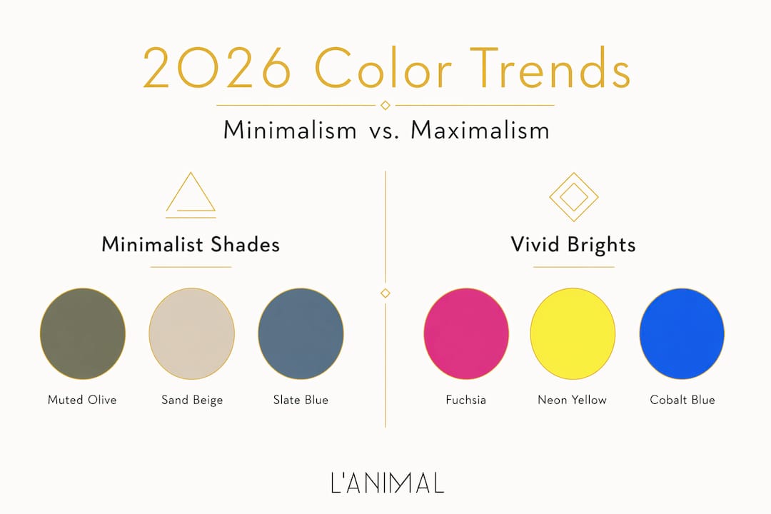
After a few seasons of quiet, muted palettes dominating resort collections, color in swimwear trends has swung back hard toward expression and volume. The 2026 runway tells a clear story: bold colors like fuchsia, cobalt blue, and lime green are leading the charge, directly linked to the idea that color in a swimsuit is not just decorative. It signals mood, confidence, and intention.

The 2026 swimsuit trends show two dominant palettes running in parallel rather than competing. On one side, minimalist silhouettes in warm neutrals, terracottas, and sandy beiges offer a polished, timeless look. On the other, maximalist tropical brights and gradient washes create energy and visual impact. Both approaches use color strategically.
What is particularly interesting in 2026 is the use of contrasting trims. Designers are placing color at borders — a cobalt blue suit with a lime green edge, or a sand-colored one-piece with a cherry red band — to define the body’s silhouette rather than relying on cut alone. Color placement becomes an architectural decision, not just a palette one.
Pro Tip: If you are building a capsule swimwear wardrobe, choose one bold piece in a trending color and anchor it with two neutrals. This gives you range without buying an entirely new wardrobe each season.
Color also functions psychologically within this trend cycle. Color selection affects mood and confidence in swimwear choices. A swimsuit is one of the few garments worn in highly public, physical, and often vulnerable settings. The emotional lift that comes from wearing a color you love — and that reads well in natural light and water — is real and worth accounting for when you choose.
Color is only as good as the fabric that carries it. This is where the importance of color in swimsuits connects directly to how you shop and care for what you own.
Chlorine exposure combined with UV light can degrade elastane by about 65% after 300 hours of pool use. That degradation does not just affect fit and stretch. It strips color. A neon green suit that looked sharp in April can turn dull and patchy by August if the fabric was not engineered to hold dye under those conditions.
Here is how to protect your swimwear color long term:
Pro Tip: When shopping, check the fabric composition label before buying. A swimsuit that is 80% or more polyester will hold its color and shape through far more wears than a blend heavy in cotton or rayon.
Understanding the role of colors in swimwear choice that flatters you specifically requires stepping back from trend lists and looking at your own coloring. Seasonal color analysis gives a useful framework here. It matches swimwear palettes to your skin undertone, hair color, and eye color to identify which shades make you look polished and put together versus washed out.
Seasonal color analysis for swimwear differs from regular clothing advice because water and sunlight change everything. Wet skin reads brighter. Natural light in outdoor settings amplifies warm undertones. Colors that work in a fitting room can shift dramatically on the beach. The best colors to wear are the ones that read well in those specific conditions, not just under store lighting.
| Season type | Skin undertone | Colors that work |
|---|---|---|
| Spring | Warm, peachy | Coral, warm yellow, bright turquoise, peach |
| Summer | Cool, pink | Lavender, soft blue, dusty rose, pale aqua |
| Autumn | Warm, golden | Burnt orange, olive, rust, warm brown |
| Winter | Cool, neutral | Fuchsia, cobalt blue, black, ice white |
A few practical points on applying this:
Knowing your seasonal type also helps you build a wardrobe that works together rather than a collection of random impulse buys that never quite coordinate.
I have spent years watching how color decisions get made in swimwear, and the most common pattern I see is people defaulting to what is trending without asking whether it works for them personally or the context they are swimming in.
What shifted my own thinking was watching how visibility conversations entered the fashion space. Safety and style had always been treated as separate discussions. They are not. When I see a swimmer in a bright neon suit and recognize immediately that this is also the most fashionable direction for 2026, I find it satisfying. It tells me that good design can carry more than one purpose without compromising either.
The piece of advice I give most often: stop treating neutral swimsuits as the safe, classic choice. In fashion terms, yes. In actual water, a dark navy or sandy beige can make a swimmer nearly invisible. If you are buying for function as well as style, a bold, high-contrast color will serve you better across more situations.
Color also gives swimwear its staying power. A well-constructed suit in a timeless but vivid color, cared for correctly, feels relevant far longer than a trend piece in a muted shade that fades by season’s end. The impact of color in swimwear is not temporary. It defines the piece.
— Lital
Lanimal brings together the color intelligence this article covers and translates it into pieces worth owning. Each collection is built around color choices that are both trend-relevant and thoughtfully constructed for wearability.

The luxury one-piece collection features sculpting silhouettes in the season’s strongest color stories, from bold fuchsias and cobalts to warm neutrals with contrasting trim details. For those who want color versatility without buying multiple pieces, reversible swimwear offers two color expressions in a single suit. Every piece is made with fabrics engineered to hold color through chlorine exposure and UV, keeping your swimwear looking as good at the end of the season as it did at the start. Browse the full collection at Lanimal and find the color that works for you.
Neon yellow, bright orange, neon green, and bright pink rank highest in visibility tests across pools, lakes, and open ocean. These colors use fluorescence to maintain contrast even in low light or murky conditions.
Blue, white, dark gray, and black are the worst choices for visibility. They blend into pool water, mimic debris, or disappear against surface glare, all of which slow recognition time in emergencies.
Color longevity depends on fabric type. Polyester and nylon hold dye much better than cotton under chlorine and UV exposure, and chlorine combined with UV light can degrade elastane by about 65% after 300 hours of use.
Start with your skin undertone. Warm undertones suit coral, tangerine, and earthy yellow. Cool undertones look sharper in cobalt, berry, and emerald. Always test colors in natural light, since outdoor conditions change how colors read on the body.
Two palettes are leading 2026: bold brights like fuchsia, cobalt blue, and lime green for high-energy looks, and warm neutrals like terracotta and sand for minimalist, timeless styles. Contrasting trims are a key design detail across both directions.


