FREE SHIPPING ON ALL US ORDERS OVER $150
-
Collections
-
Bikini
- One Pieces
- Cover-Ups
- Men's
- Sale
- MODA GLAM x L'ANIMAL
- Nice Breed
- Gift Card
-

Wearing prints on vacation is defined as the practice of using patterned clothing, from florals to geometrics, to build stylish resort and beach outfits. This guide to wearing prints on vacation covers the three principles that matter most: print scale, color cohesion, and mix-and-match strategy. Get these right and your vacation outfit ideas go from scattered to intentional. The foundational rule is simple: one dominant print, a limited color palette, and at least one solid neutral piece to anchor the look.
Medium-scale prints suit most body types universally, making them the safest starting point for any traveler. They are large enough to read clearly in photos but not so bold that they overwhelm a smaller frame. Large-scale prints, like oversized florals or wide geometric blocks, work best on taller frames where the design has enough surface area to show fully. Petite travelers who wear large-scale prints often find the pattern gets cut off at the hem or shoulder, breaking the visual flow.
Small-scale prints serve a different purpose. They work well for layering, as a second print in a mixed outfit, or when you want a subtle, refined look rather than a statement. A small ditsy floral paired with a solid linen pant, for example, reads as polished rather than loud.
Here is a quick breakdown by frame:
Pro Tip: Before packing a printed piece, hold it up and check that the print’s repeat is not cut awkwardly at your bust or hip. A misplaced repeat can make even a great print look off.
Mixing patterns on vacation sounds intimidating, but it follows a clear set of rules that any traveler can apply. The most reliable technique is scale contrast: pair one large, dominant print with a smaller, quieter print so the two do not compete for attention. A bold tropical floral top paired with a thin-striped sarong works because the scales are clearly different.
Color cohesion is the second rule. All prints must share one core color, and the total palette should stay within 2–3 colors. If your floral top pulls cobalt blue, terracotta, and white, your second print should repeat at least one of those colors. This creates a planned look rather than a chaotic one.
The third rule is anchoring. A single neutral piece, like solid white sandals, a tan woven bag, or a cream linen shirt, gives the eye a place to rest. Without a neutral anchor, two prints worn together can feel relentless.
Here are the most reliable print combinations for vacation:
| Print combination | What makes it work |
|---|---|
| Large floral + thin stripe | Scale contrast prevents visual competition |
| Animal print + tonal geometric | Animal print reads as a neutral anchor |
| Bold geometric + micro ditsy | Clear size difference keeps one print dominant |
| Tropical botanical + solid neutral | Neutral piece grounds the bold print |
Pro Tip: If you are new to mixing patterns on vacation, start with printed accessories before committing to two printed garments. A printed scarf tied to a solid dress is a low-risk way to test your comfort level.
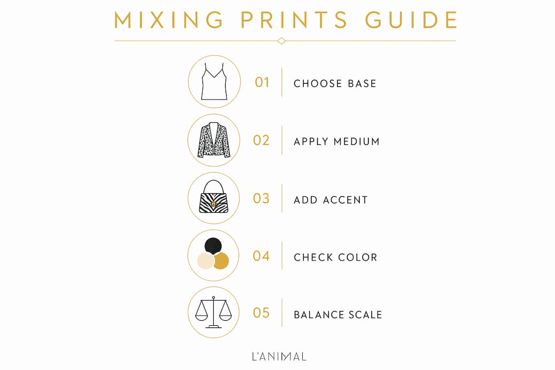
Building a printed vacation outfit works best when you follow a sequential process rather than pulling pieces at random. Stylists recommend starting with one dominant print piece you already love and feel confident in. That piece sets the color palette and the energy of the whole outfit.
Follow these steps to assemble the look:
A few additional outfit checks before you leave the room:
You can also apply the anchor-medium-accent rule for a more layered look: one large print as the anchor, a medium complementary print as the second layer, and a subtle accent print in an accessory like a printed shoe or scarf. This three-tier approach creates depth without chaos.
Tropical botanical prints, bold geometrics, and abstract patterns are the strongest choices for beach and resort settings. They match the energy of coastal backdrops and photograph well in natural light. Color-block geometrics in particular work well for swimwear because the strong lines create a flattering, graphic effect against the water.
Monochrome prints, like black-and-white palm prints, are the best starting point for travelers new to stylish printed clothing. They offer a tropical feel without the color complexity, making them easier to style with existing wardrobe pieces.
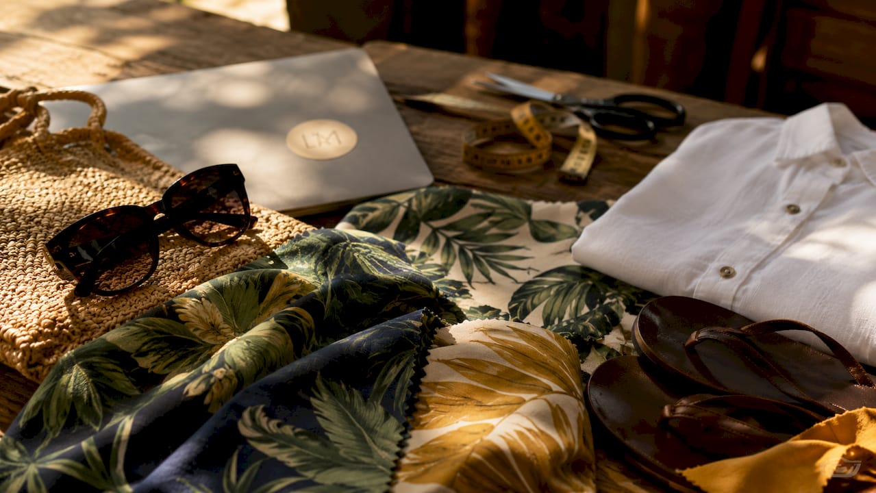
Fabric choice matters as much as print choice. Linen, crochet, and woven straw textures complement prints and add a layer of vacation-appropriate texture. A bold floral print in stiff polyester reads differently than the same print in soft linen. The linen version feels relaxed and intentional. The polyester version can look costume-like.
Here is how to pair fabric texture with print intensity:
Print placement also shapes how a garment fits visually. A print centered at the bust draws the eye upward. A print concentrated at the hem adds visual weight to the lower body. Knowing where the print falls on your body lets you use it to your advantage when building a vacation wardrobe.
Wearing prints on vacation requires three things: the right print scale for your frame, a shared color palette across all pieces, and at least one solid neutral to anchor the look.
| Point | Details |
|---|---|
| Match print scale to your frame | Medium-scale prints suit most body types; large prints need height and surface area to work. |
| Use color cohesion | All prints in one outfit must share at least one core color, limited to 2–3 colors total. |
| Anchor with a neutral | One solid piece, like white sandals or a tan bag, prevents a multi-print outfit from feeling chaotic. |
| Structure adds polish | At least one tailored or fitted piece transforms a print outfit from casual to intentional. |
| Let the print lead | Keep accessories simple and solid so the print remains the focal point of the outfit. |
Wearing prints confidently is not about following every rule perfectly. Confidence in prints comes from choices that align with how you want to feel, not from chasing what looks good on someone else. I have seen women pull off the most unexpected print combinations simply because they wore them with ease. The outfit worked because they did.
My strongest advice: start with a silhouette you already know fits you well, then add the print. If you love a wrap dress, find it in a tropical floral. If you feel best in a high-waist bikini bottom, find it in a bold geometric. The familiar fit gives you a foundation of comfort, and the print does the rest.
Choosing prints based on mood and personal style rather than trend cycles is what separates a great vacation wardrobe from a forgettable one. Trends shift every season. How you feel in a print on a beach in the sun does not.
One more thing: prints photograph beautifully in natural light. A bold botanical print or a graphic color-block swimsuit against a clear blue ocean is one of the most effortless vacation photos you can take. Wear the print. Take the photo. You will not regret it.
— Lital
Lanimal was built around the idea that vacation style should feel as good as it looks. The brand’s printed swimwear and resort wear collections are designed to make the principles in this guide easy to apply in real life.
The Sportif Bikini Bottom is a strong example of how a structured printed piece anchors a vacation look. Its clean lines and confident print work as the anchor piece in any outfit, pairing naturally with solid neutrals or a quieter second print. Browse the full Lanimal collections to find printed pieces that pair with the solid neutrals and complementary prints already in your wardrobe. Each collection is curated with color cohesion in mind, making it straightforward to build outfits that look planned rather than accidental.
Start with one printed piece in a silhouette you already feel confident in, then pair it with solid neutrals. Monochrome prints like black-and-white palm prints are the simplest entry point for new print wearers.
Use scale contrast and color cohesion. Pair one large print with a smaller print, and make sure both share at least one core color within a 2–3 color palette.
Tropical botanicals, bold geometrics, and abstract patterns suit coastal settings best. They complement natural light and photograph well against ocean and sand backdrops.
Keep accessories simple and solid when wearing a bold print. Over-accessorizing with competing elements is the most common mistake with bold prints. Let the clothing print lead.
Linen, cotton, and crochet complement most vacation prints. Soft, drapey fabrics balance bold prints, while textured fabrics like crochet add interest to quieter, tonal patterns.


